Personality
„Oldrich Hlavsa's name has become a symbol of art and typography“
— Jiri Setlik, art historian
“The point is to make a point”
— Oldrich Hlavsa, 1963
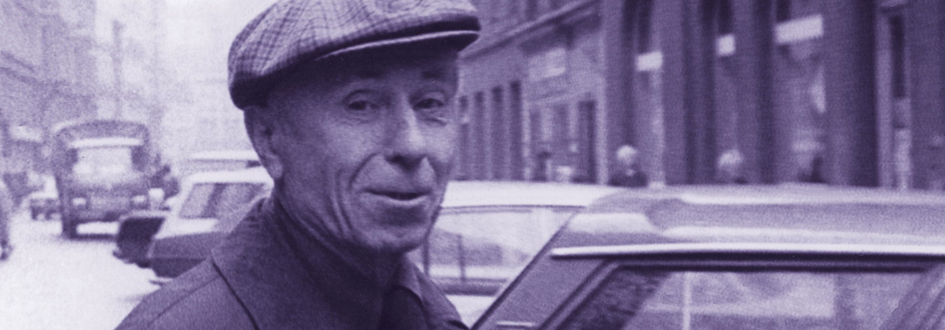
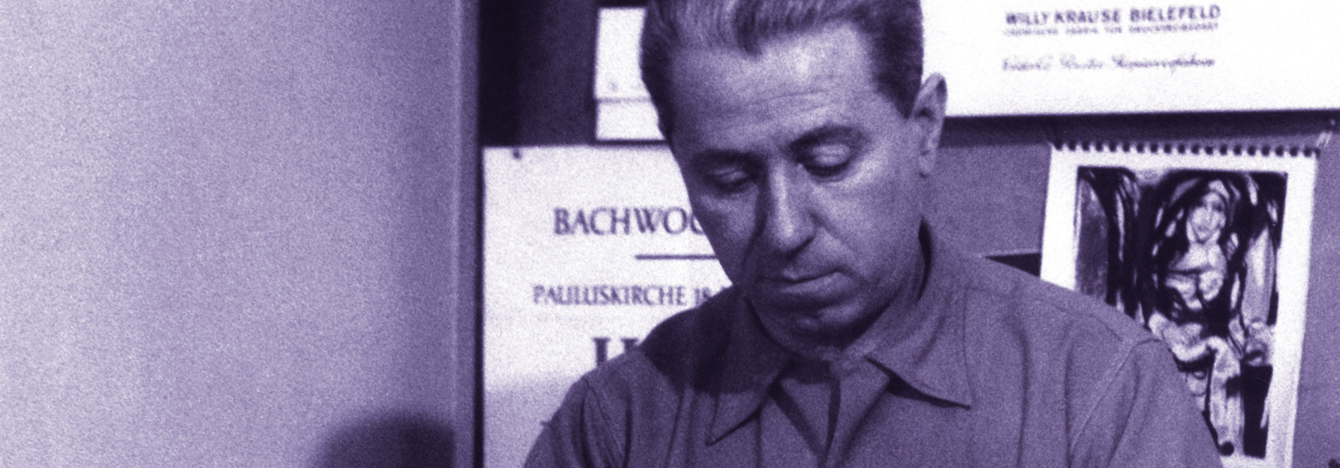
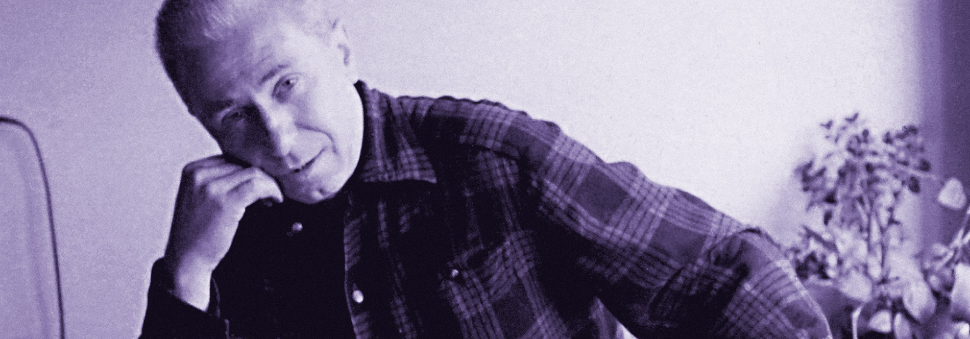
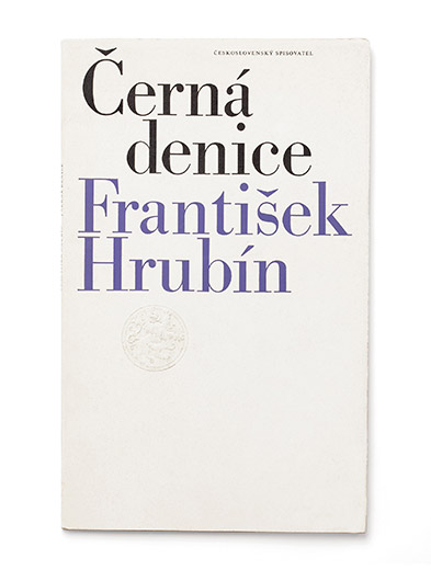
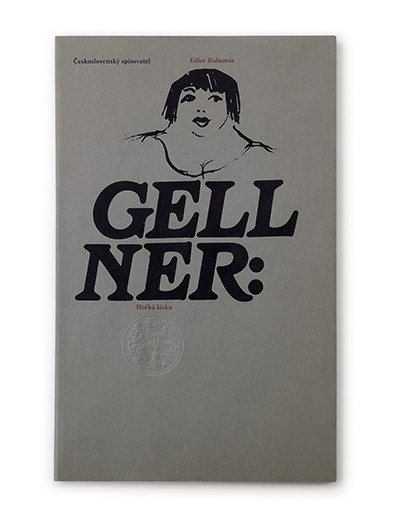
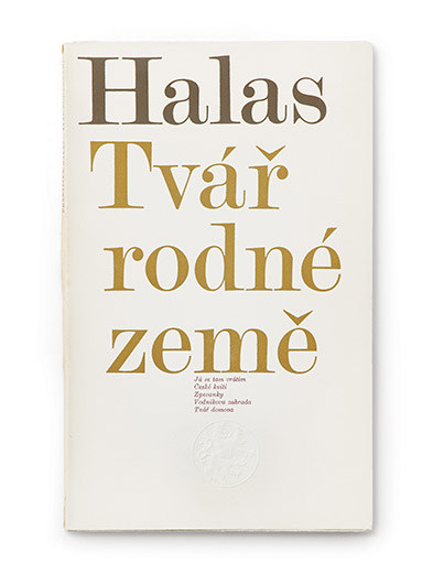
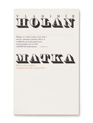
The Czech book designer and typographer Oldřich Hlavsa (1909–1995) had a decisive influence on late 20th century Czech graphic design. Hlavsa worked in the field of graphic design for more than sixty years, creating about 2000 book designs, through which he formed distinctly new visual and communicative values of typeface and markedly influenced the vision of the intellectual and artistic concept of the book. Hlavsa focused his artistic efforts on the book, regarding it as a means of communication, an individual work of art that makes a complex impression. It combines ideas, esthetic perception, and demands the reader’s interaction. On the one hand, Hlavsa’s conception of (typo)graphic design continues the tradition of the classic Czech typography of Karel Dyrynk, Oldřich Menhart or Method Kaláb; on the other hand, it simultaneously follows the Czech avant-garde, i. e. the work of Karel Teige and Ladislav Sutnar. However, the constructional and functional elements get a new content in Hlavsa’s typographic work: above all, Hlavsa brings a very distinctive artistic approach which always constructs a book or a periodical as a deliberate and compact structure.
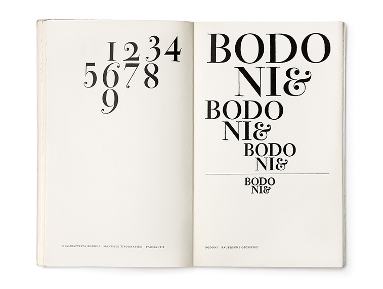
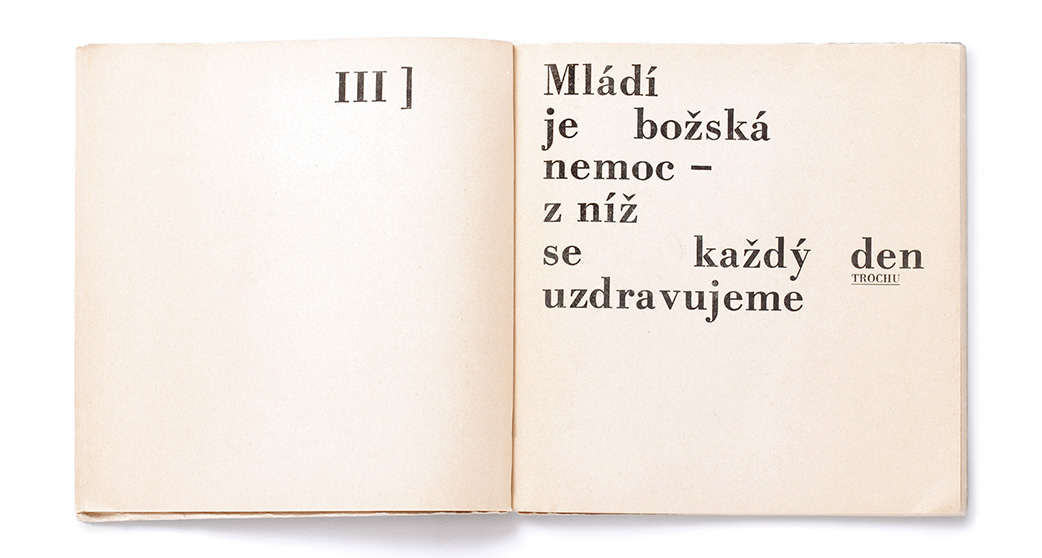
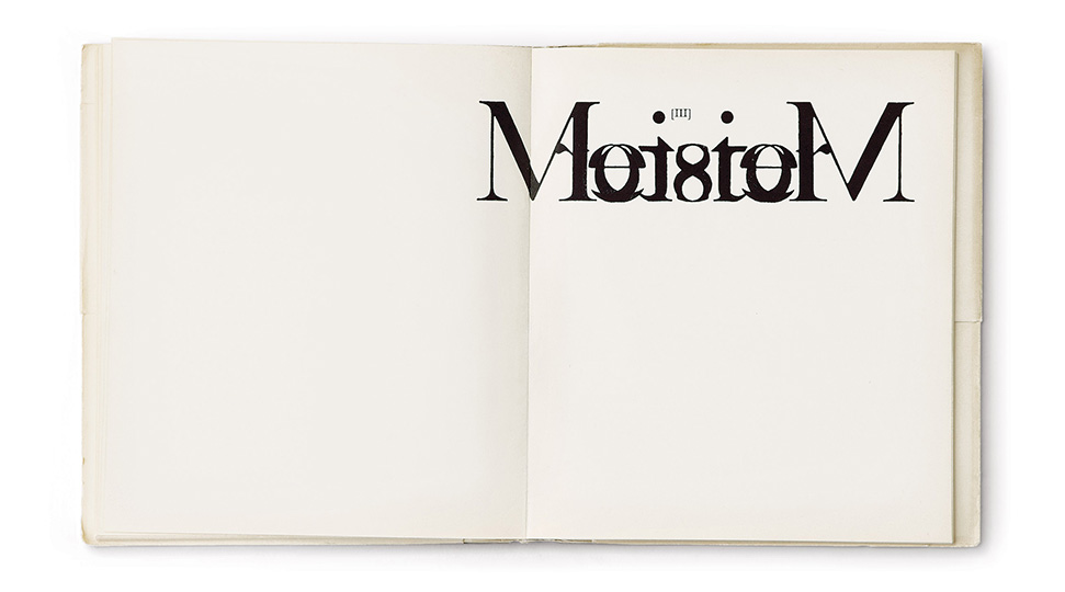
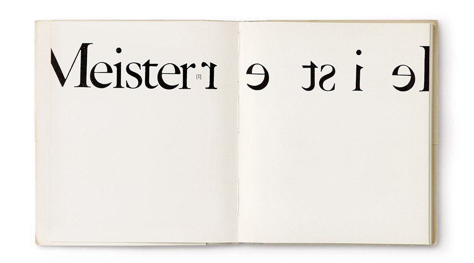
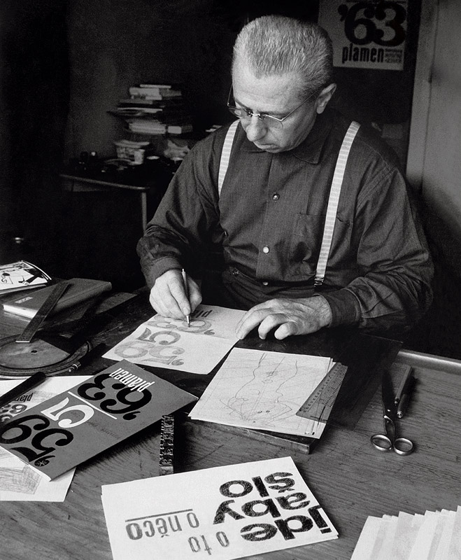
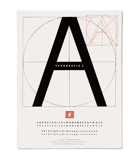
For Hlavsa, typeface represents the creative foundation and the most important constructional element
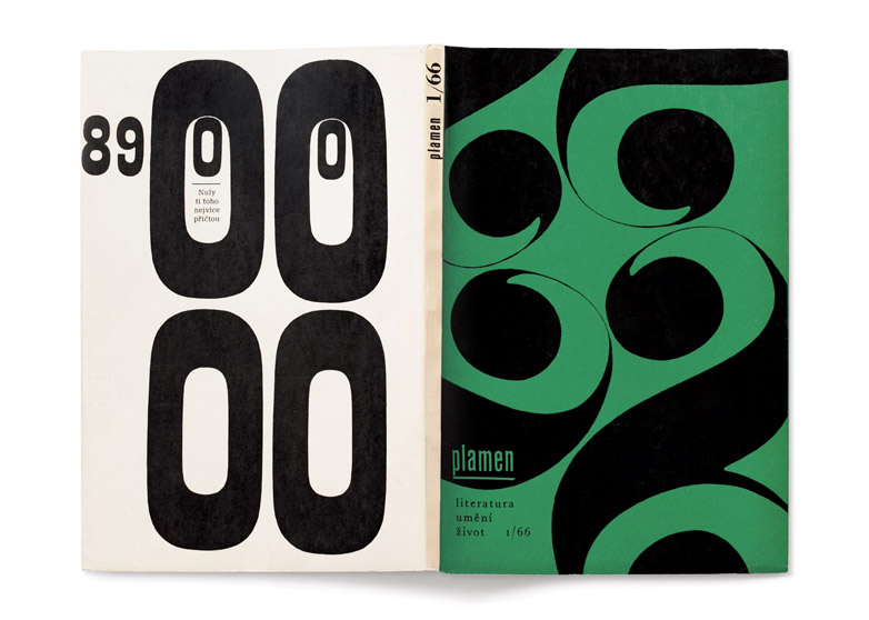
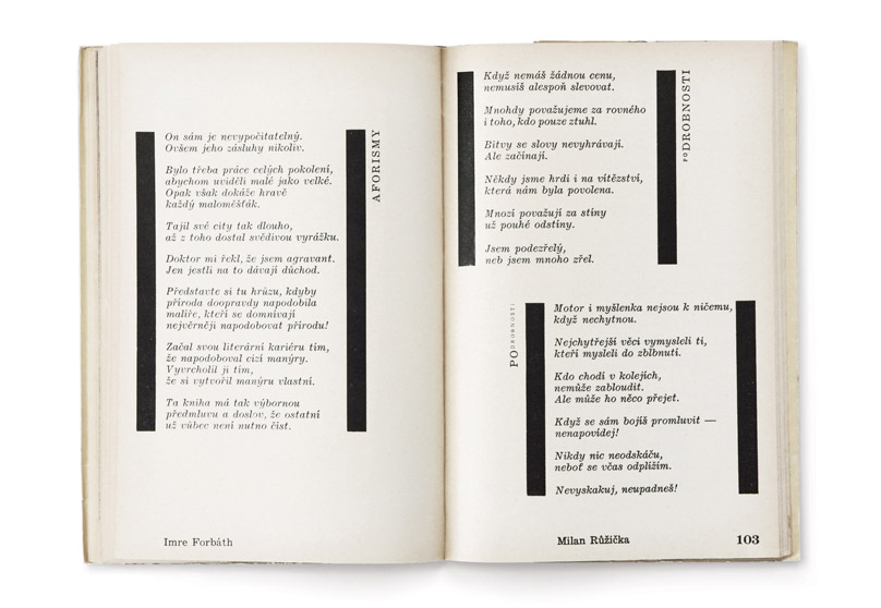
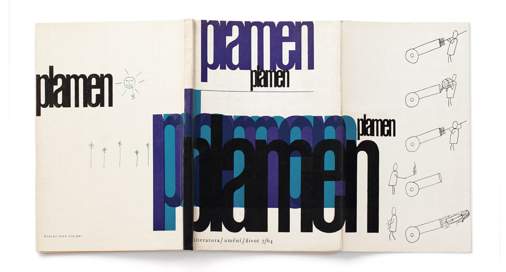
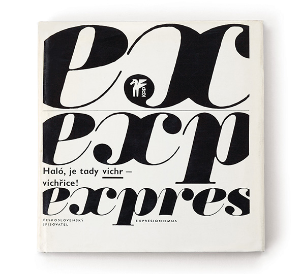
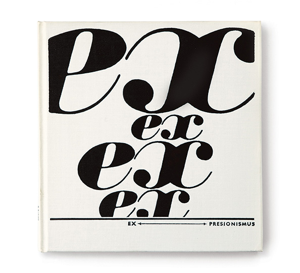
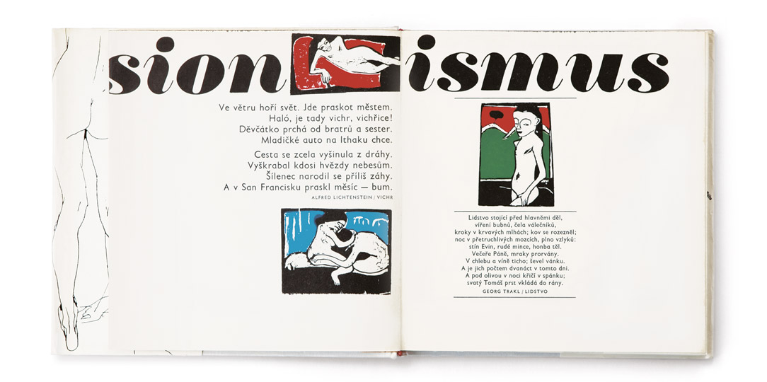
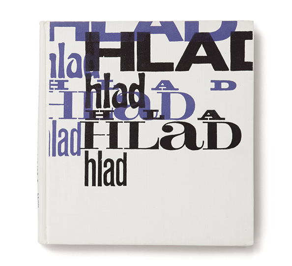
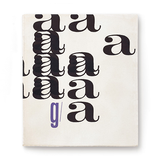
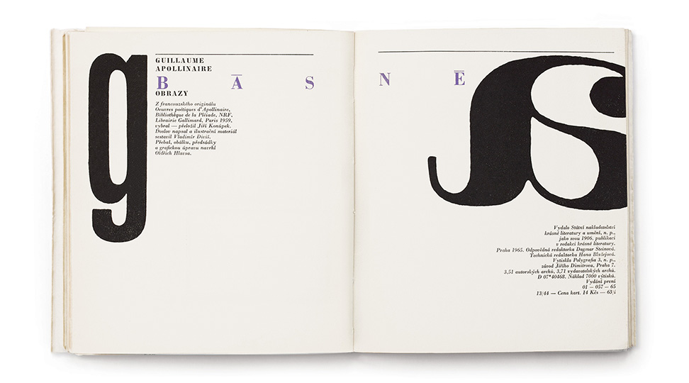
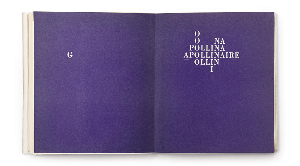
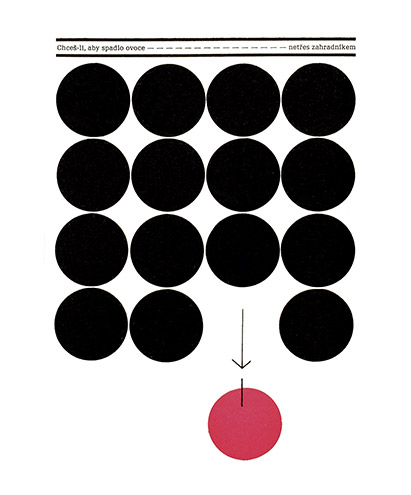
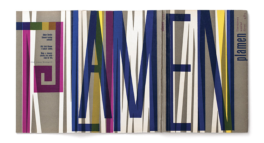
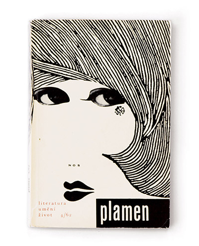
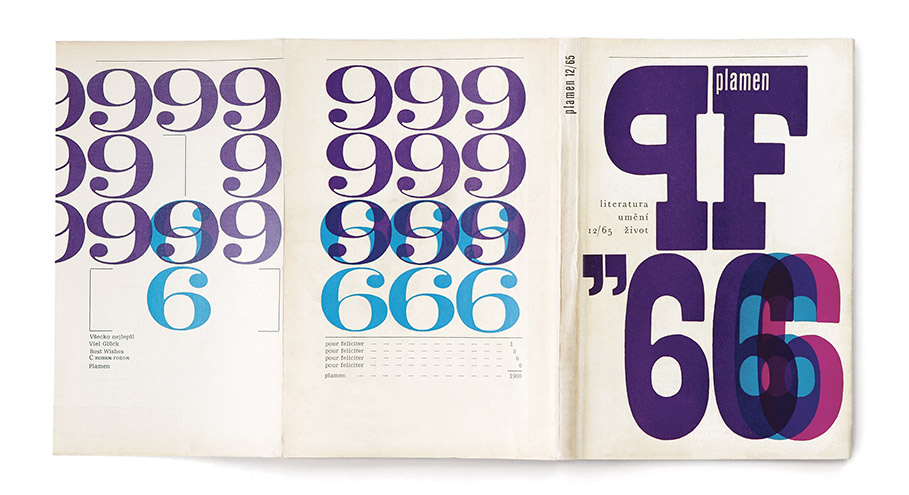
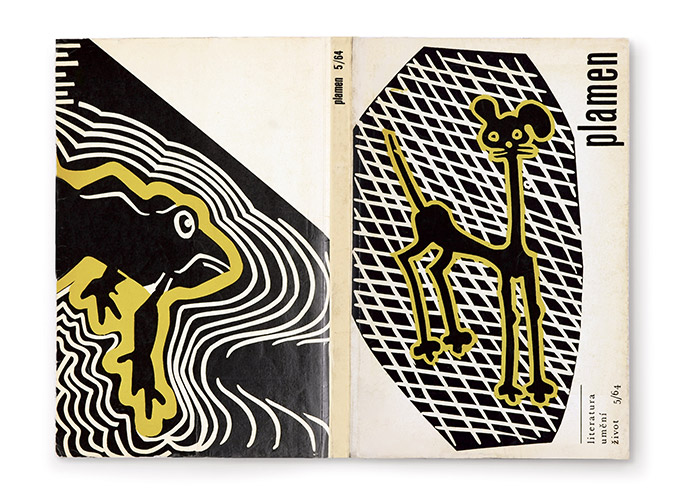
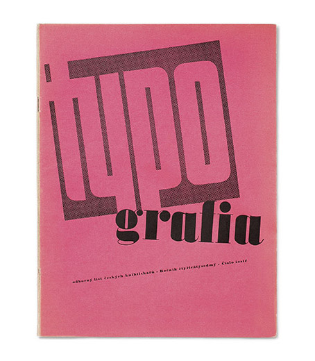
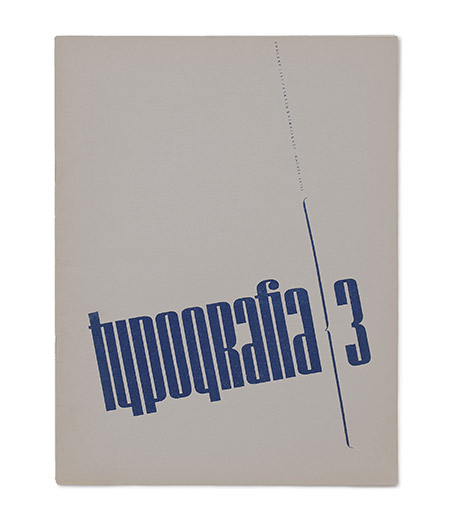
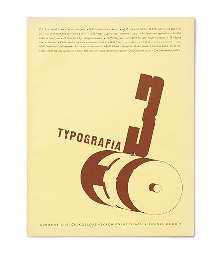
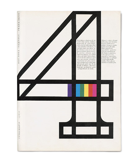
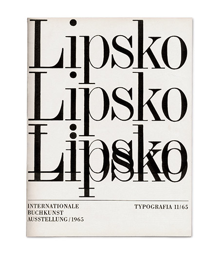
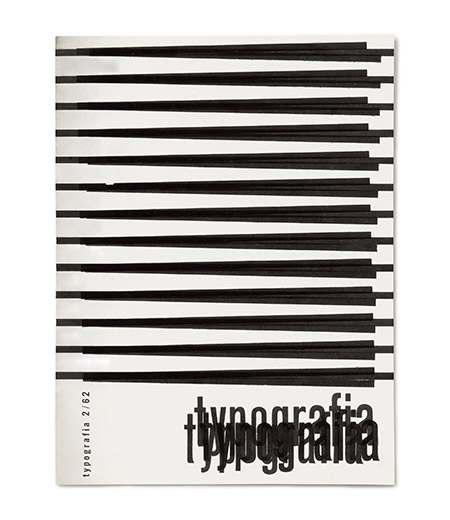
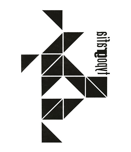
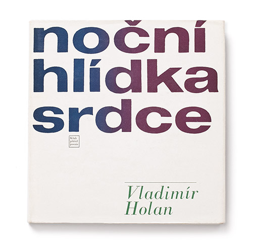
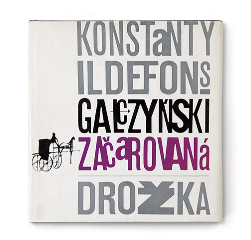
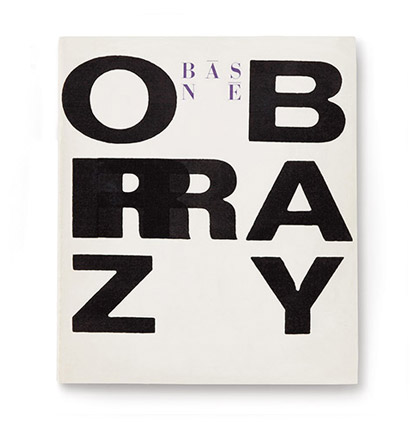
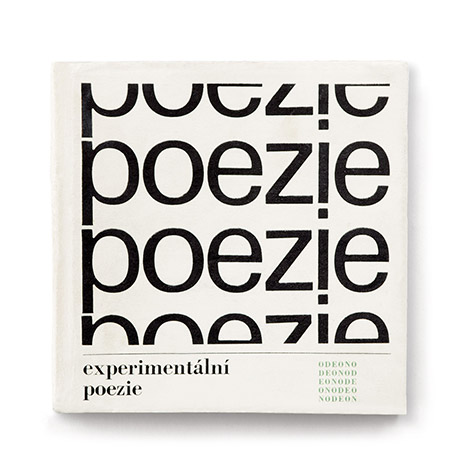
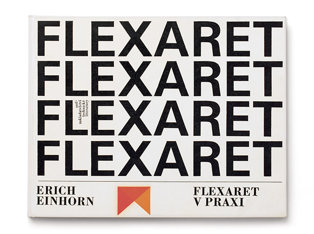
In 1965, Hlavsa expressed his attitude to typeface when he indicated his artistic contribution in the colophon: he replaced the words cover, binding, graphic design with the single expression typography. Today we distinguish between a graphic artist (or graphic designer) and a typeface designer / typographer, but Hlavsa regarded himself as a typographer and always referred to himself as such, although he never designed an original typeface. For Hlavsa, typeface represents the creative foundation and the most important constructional element, which he puts on par with image and illustration. Hlavsa always searches intensively for new expressive possibilities of lettering, while drawing on his knowledge (perfected through experience) of this “black” craft. Hlavsa gained this knowledge as a skilled display typesetter and later through longtime practice. The experience and knowledge of his craft gave him a stable background which helped him become a tireless experimenter and individualist, following his unique artistic intuition, fully using the technical facilities and breaking the established rules that he has superbly mastered. He experiments with various book sizes and materials; he designs various folders and bookmarks inside the book, as well as unconventional bindings which still amaze us by their singular originality of concept and at the same time, their simplicity of production. He bases his work on the unity of opposites and the tension of contrasts, the result of which are book and magazine units that are created with an exquisite sense of rhythm and express charming dynamism. Hlavsa’s typographic solutions succeeded in imbuing the repetitive repertory of typeface with the impression of originality and diversity, clearing it of the tinge of historic academism.
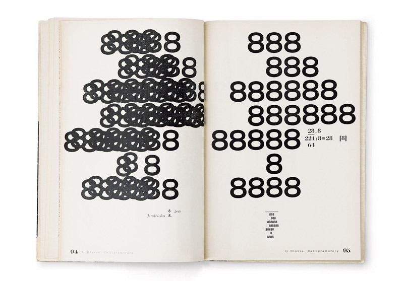
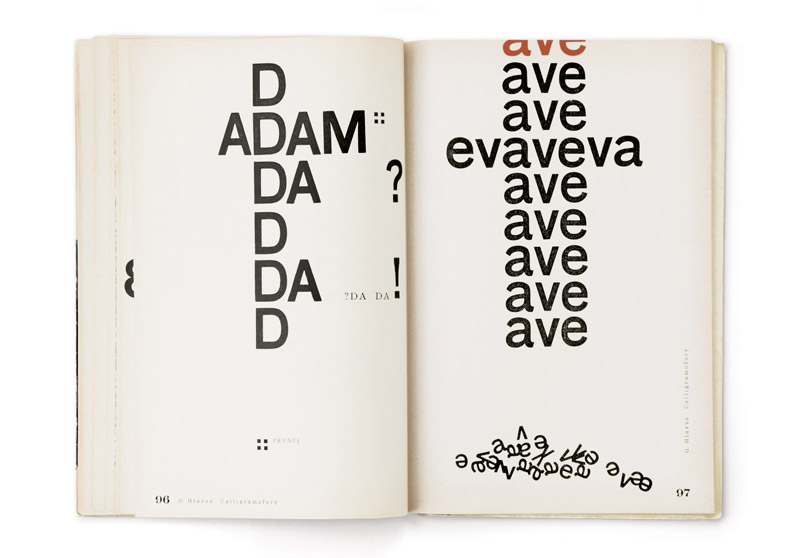
“Type-images”
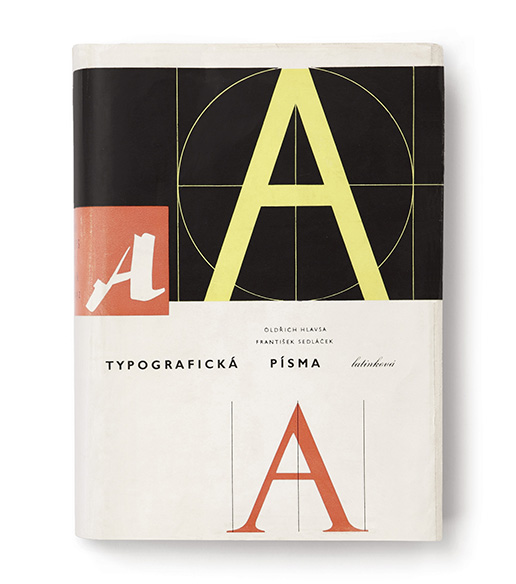
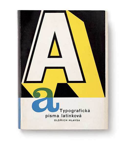
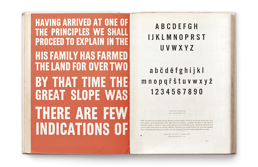
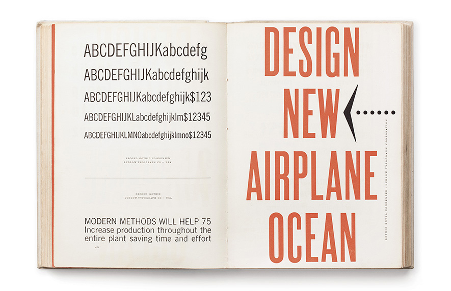
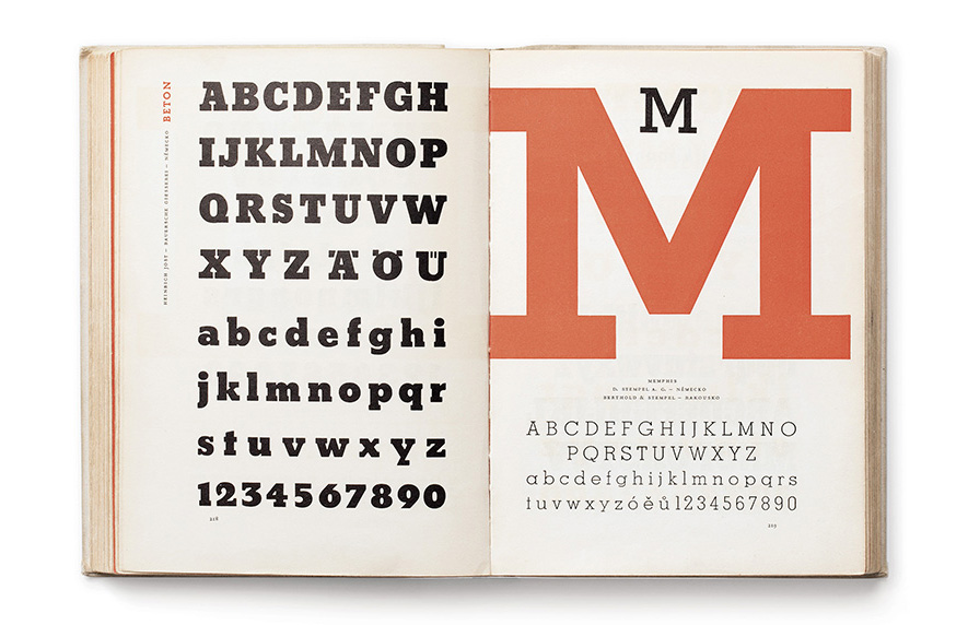
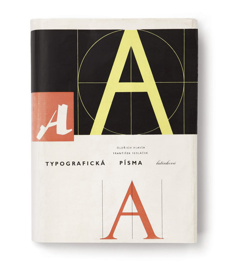
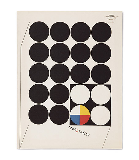
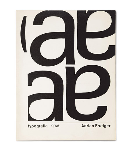
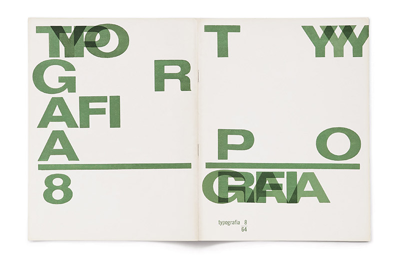
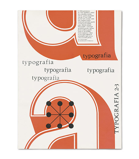
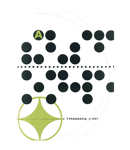
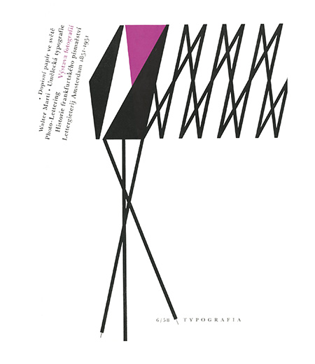
Hlavsa’s expression is often close to the non-figurative tendencies of the fine arts of his time. His “type-images” (as Ladislav Sutnar called Hlavsa’s typographic compositions) suggest a wide reference to the typeface experiments of the Futurists and Dadaists, or to the movement of visual poetry and Lettrism in the 1960s. At the same time, Hlavsa does not give up on the semantic value of the word and does not take the letter away from its functional value as a means of communication. He sees in typeface an object with its own individuality, a visual and conceptual synthesis, and a graphic record of language. There is a tension, sometimes even a clash between the attitude of a fine artist who works with a purely visual value of signs, and a typographer whose primary aim is to give information. Thanks to his singular artistic intuition and common sense, Hlavsa managed not only to keep up-to-date with the world, but also to create work whose quality was repeatedly acknowledged from the 1960s onward by prestigious international awards. Hlavsa’s world renown was confirmed by his own book Typografická písma latinková [Typographic roman fonts] (1957) co-authored with František Sedláček. This book met with such a great response from the international professional public that it was re-published in an English-language version as A Book of Type and Design in 1960.
Other benefits
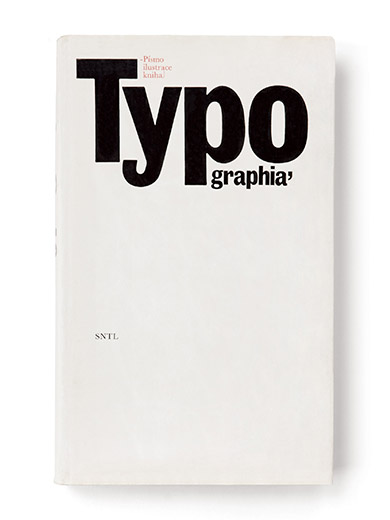
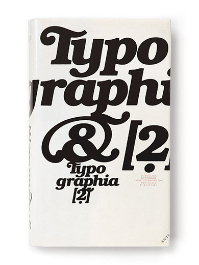
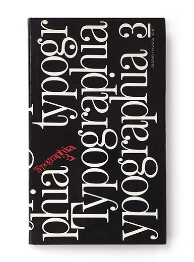
The essential significance of Hlavsa’s personality lies not only in his original artistic contribution but also in that he always sought to increase the level of his own profession and the general awareness of it. He was a member of many international institutions and committees for applied graphic arts, he participated in the activity of numerous international juries in the book design field, he published his writings, and he taught various courses of display or book typography. He fought for a higher quality of local polygraphy and typographic education in general. Hlavsa’s teaching and publishing activity reached its peak with the three-volume Typographie (1976, 1981 and 1986). These books focus on the history and issues of contemporary typeface but at the same time present his own typographic work on a large scale. These Hlavsa's publications also received great response from professional public, and they are still counted between the fundamental works of Czech graphic design. In 1991, Hlavsa's work was crowned by the prestigious Gutenberg prize of the city of Leipzig, as a recognition for his lifetime extraordinary work in book design.
— Barbora Toman Tylová
Work
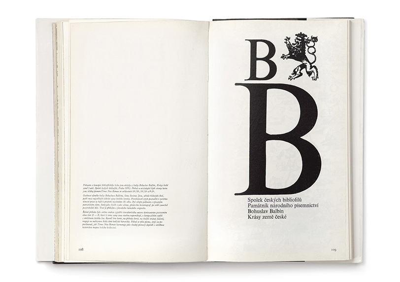
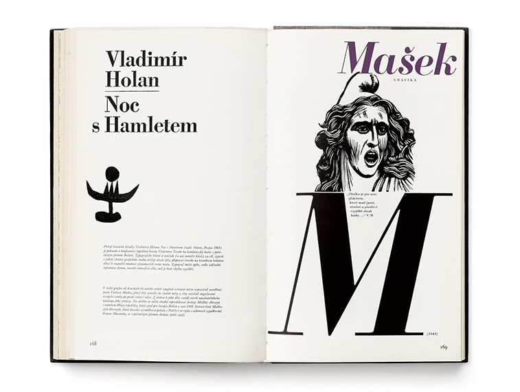
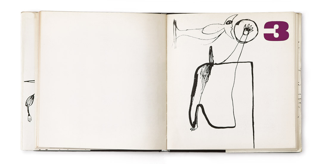
 Look Inside
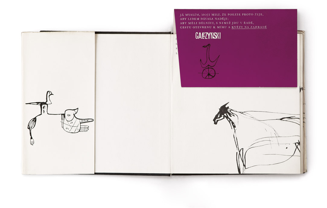
 Look Inside
 Look Inside
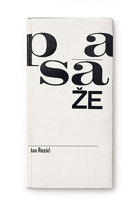
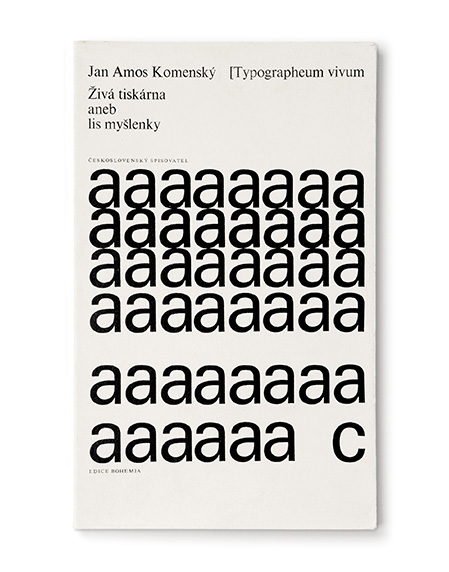
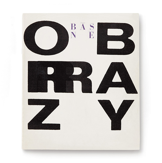
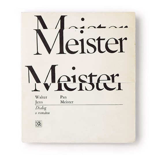
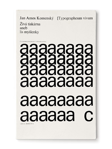
aneb, Lis myšlenky, 1968, dust jacket
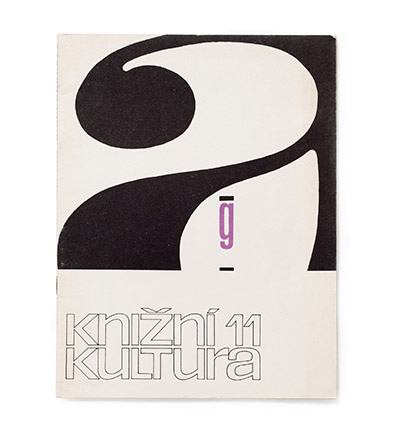
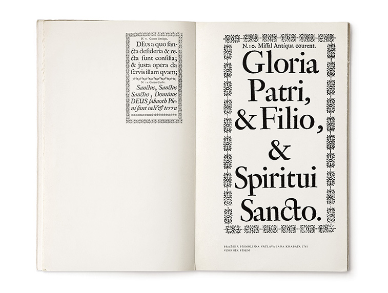
a otázky knižního trhu. Roč. 2, č. 11. cover
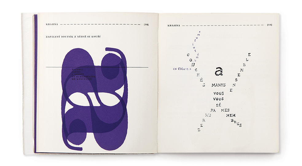
 Look Inside
 Look Inside
 Look Inside
 Look Inside
 Look Inside
 Look Inside
 Look Inside
 Look Inside
 Look Inside